Submissions season has just whizzed by. I've been busy putting together packages of my best work and brilliant ideas so I can *fingers crossed* get more art into the world and hopefully into happy forever homes.
Perhaps the most important part of submissions packages (besides getting the varying file-naming conventions right) is, of course, the documentation of work. Beyond giving the work its time to shine, I think carefully documented pieces inspire confidence in committees, juries, and potential collectors; it shows that not only one's skills in their chosen medium, but also that they're taking this whole artlife seriously.
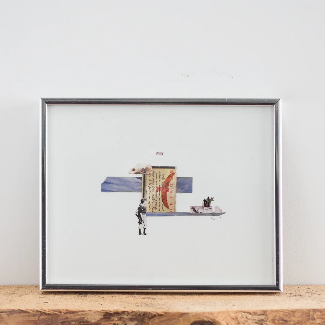
Documenting work (or doing copywork - does anyone call it that?) is a skill I learned early on in architecture school. In my first years of undergrad just over a decade ago we were still using drafting tables and drawing on huge sheets of paper by hand. The sheets were too big for scanners, so we put together our portfolios by photographing our work using slide film, either at the one documentation station in the school, or outside on the school's walls on overcast days. Sharing skills and knowledge is one of my favourite things, so I snapped some photos during my last documentation-session to demonstrate how to photograph work in glass frames with minimal camera/lighting equipment.
First thing's first: I do all my work at home. For documentation, I've found that my closet can be transformed into a pretty ideal set up. Resourcefulness is for sure the name of my game.
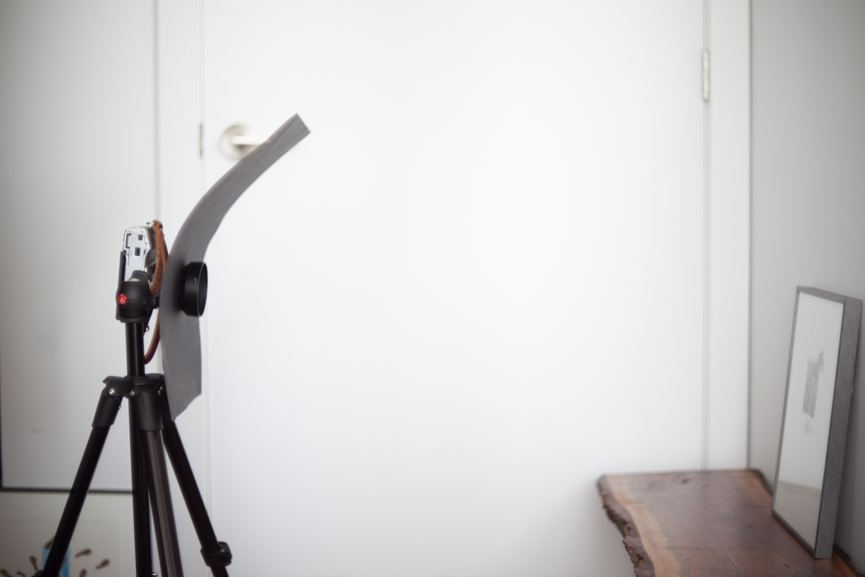
The most difficult thing about photographing work behind glass (or varnished pieces) is cutting reflections or preventing light from bouncing everywhere. This is why I drape a dark gray sheet over all of the mess in my closet, and attach that black sheet of paper to my lens (in technical photography terms, the sheet's called a go-bo, or go between).
Because my camera has silver details on its body, the glass of the frame can catch its reflection. The go-bo prevents this, but sometimes the size and position of the frame catches my own reflection, so I always set the camera on timer and run out of the closet after pushing the shutter release. I could also use my camera remote, but it's fun to push and run. In either case, going hands-free reduces camera shake and results in sharp images.
In terms of lighting, I'm so, so lucky to live in a place with south-facing window walls. A couple meters perpendicular to the right of the camera is a bright floor to ceiling window with a translucent white covering. The closed white door on camera left doubles as a reflector, and that's my entire lighting set up. I make sure to turn the light in the closet off during my shoots to get even lighting, and again, to cut unnecessary reflection.
The tripod is essential not only for being able to run out of frame, but for keeping the camera steady during typically slower exposures. For the technically inclined: I shoot on aperture priority mode, ISO 100 to reduce grain, and f8 or higher to ensure things are evenly sharp - this set up results in the camera operating at a slow shutter speed with sharp, beautifully detailed images (I zoom in on each shot to check that I can see the texture of my watercolour paper and all the other meticulous details). I shoot on S-AF M so the camera's autofocus does most of the focusing work, but I can fine tune if necessary. I always shoot in RAW mode to preserve image quality, and to get flexibility with exposure and colour balance.
As I learned in architecture school, it's generally easier to get things square and level in camera than to try to fix everything in post-production. When propping the piece up against the wall, I make sure that the entire top edge is flush against the wall, and then I angle the camera so the lens is parallel to the surface of the frame. The 25mm lens I use on my Olympus OM-D camera is equivalent to a 50mm lens on full-frame cameras, so generally there's little barrel distortion, which means lines tend to photograph straight. Sometimes the distortion can't be helped, but luckily it can be corrected in Adobe Lightroom which I use to process all of my photos.
White balance and colour correction are things I trust to my camera and my eye, though I do have the option to set light balance in camera by using grey-cards or pointing the lens at another reliable neutral colour.
In post-production/editing, the changes usually involve bumping up the exposure just a little bit more to get white-whites in the paper, making sure the lines are level (even if it's just a tenth of a degree adjustment), and final crops.
And that's all there is to it! Lately I've been considering offering documentation services to fellow artists - what do you think, Ottawa? I'm around if you have any questions or need help with this process - feel free to get in touch :)
